Checkout Flow
My Role:
- User Research
- Paper Prototypes
- High-Fidelity Prototypes
Tools:
- Figma
Project Type:
Private Project
Project Year:
2023

Overview
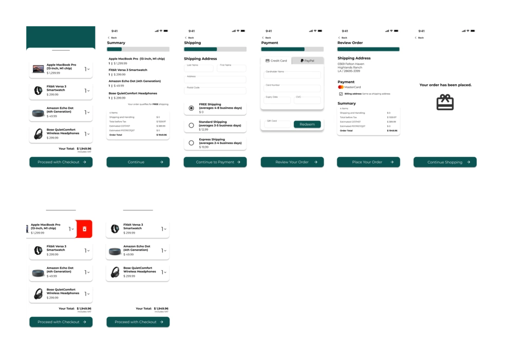
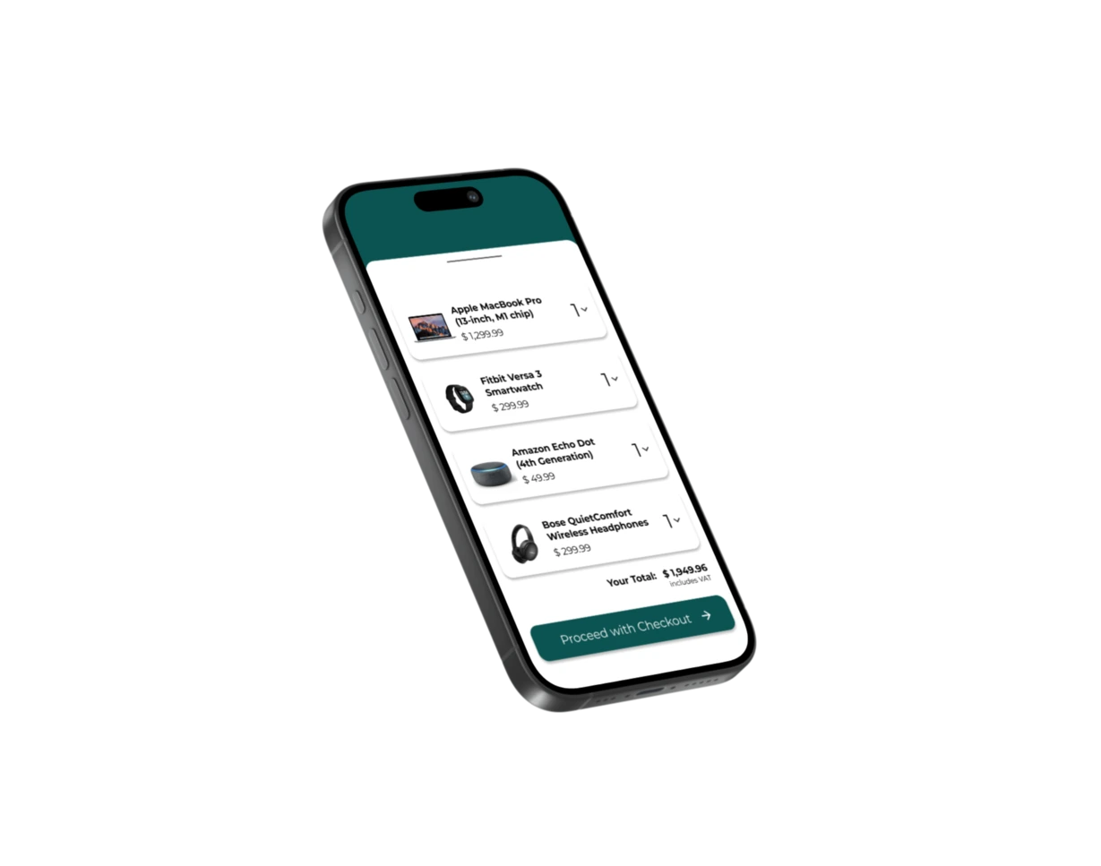
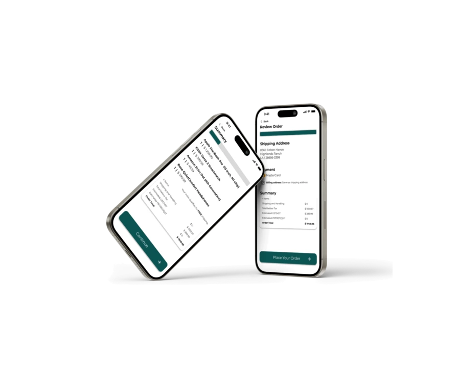
This project was all about rethinking the checkout flow of a typical online shop. I wanted to create a process that feels easy, clear, and just… works, without making people stop and think too much.
From cart review to payment and order confirmation, the goal was to remove friction and build trust with good design.
Process
The Brief
The task was to take the standard checkout process and make it better, more usable. I wanted people to feel like they know exactly where they are, what’s happening and what they’re paying for.
User Pain Points
While looking at examples and going through flows myself, I found a few common issues:
- Cluttered forms
- Unclear error messages or pricing details
- No overview
- Layouts that don’t work
Design Approach
I started with a basic wireframe and added step-by-step improvements.
I also included little details like defaults, form field feedback and a visual progress bar etc.
Final Thoughts
It’s always interesting how something so “standard” like a checkout can still be full of problems. This project showed me how important it is to really look at the details, because they’re what make or break the experience.
I really enjoyed simplifying things and creating a flow that just feels right. Sometimes that’s all good design is.